容器如果用得合適,可以讓程式碼乾淨非常多,執行效率也會獲得提升,維護成本也低,故在這裡記錄常用的容器並示範一些特性,常用的容器不外乎這幾個
Grid:最常用,具有自動擴展的特性,容器內的子項目有深度的概念,在同欄同列時,容器內子項目的對齊位置是一致的但深度不同,可自行定義欄與列及跨欄跨列。
StackPanel:具有向下堆、向右堆的特性,容器內的每個子元件會接在上一個的右側或底部,子元件之間沒有深度的關係。
Canvas:如名稱一樣,容器內的每個子元件必須指定 Left 與 Top 的絕對位置。
WrapPanel:基本特性與 StackPanel 相同,可指定子元件向下或向右堆,在到達容器的寬或高的邊界時,會自動換欄或換列,需注意有沒有指定寬高的差異。
以下先使用 Grid 子元件對齊的特性,預設為水平置中、垂直置中,三個方塊由深至淺的疊在一起,且可以發現顏色最淺的方塊在不指定寬高的狀況下,預設為展開至填滿容器。

<!-- HorizontalAlignment 預設為 Stretch -->

<Grid>

    <Rectangle Fill="#AAAAAA"/>

    <Rectangle Fill="#777777" Width="120" Height="120"/>

    <Rectangle Fill="#333333" Width="50" Height="50"/>

</Grid>
Grid 也提供定義欄、列的方法,並且支援跨欄、跨列,這是其他容器最無法取代的特性。

<Grid>

    <Grid.RowDefinitions>

        <RowDefinition/>

        <RowDefinition/>

        <RowDefinition/>

        <RowDefinition/>

        <RowDefinition/>

    </Grid.RowDefinitions>

    <Grid.ColumnDefinitions>

        <ColumnDefinition/>

        <ColumnDefinition/>

        <ColumnDefinition/>

        <ColumnDefinition/>

        <ColumnDefinition/>

    </Grid.ColumnDefinitions>

    <Rectangle Fill="#EEEEEE" Grid.Row="0" Grid.Column="0" Grid.ColumnSpan="4"/>

    <Rectangle Fill="#BBBBBB" Grid.Row="0" Grid.Column="4" Grid.RowSpan="4"/>

    <Rectangle Fill="#888888" Grid.Row="4" Grid.Column="1" Grid.ColumnSpan="4"/>

    <Rectangle Fill="#555555" Grid.Row="1" Grid.Column="0" Grid.RowSpan="4"/>


    <Rectangle Fill="#BBBBBB" Grid.Row="1" Grid.Column="1" Grid.ColumnSpan="2"/>

    <Rectangle Fill="#888888" Grid.Row="1" Grid.Column="3" Grid.RowSpan="2"/>

    <Rectangle Fill="#555555" Grid.Row="3" Grid.Column="2" Grid.ColumnSpan="2"/>

    <Rectangle Fill="#EEEEEE" Grid.Row="2" Grid.Column="1" Grid.RowSpan="2"/>


    <Rectangle Fill="#333333" Grid.Row="2" Grid.Column="2"/>

</Grid>
StackPanel 預設的對齊方式為水平或垂直置中,排列方向預設為垂直,垂直排列時,對齊方式會改為至頂及左右置中,可以發現圖中並沒有出現顏色為 #AAAAAA 的矩型,因為這個矩型沒有指定寬高加上 StackPanel 並不支援讓子項目自動延展至填滿,由於缺乏這個特性,大多數複雜的排版還是比不上 Grid 來得適合。

<!--

Orientation 預設為垂直

HorizontalAlignment 預設為 Center

VerticalAlignment 預設為 Center

-->

<StackPanel>

        <Rectangle Fill="#AAAAAA"/>

        <Rectangle Fill="#777777" Width="120" Height="120"/>

        <Rectangle Fill="#333333" Width="50" Height="50"/>

</StackPanel>
刻意放置較多的元件,可以發現子項目一直被往右堆出容器之外。

<StackPanel Orientation="Horizontal">

    <Rectangle Fill="#AAAAAA" Width="50" Height="50"/>

    <Rectangle Fill="#777777" Width="50" Height="50"/>

    <Rectangle Fill="#333333" Width="50" Height="50"/>

    <Rectangle Fill="#FF3333" Width="50" Height="50"/> <!-- 紅色 -->

    <Rectangle Fill="#00AED8" Width="50" Height="50"/> <!-- 藍色 -->

    <Rectangle Fill="#DDDD66" Width="50" Height="50"/> <!-- 黃色綠 -->

</StackPanel>
如果想要讓上面這種多項目的排版能支援自動換欄或換列,將容器換成 WrapPanel 即可,在 Windows Phone 若想達到一樣的效果,官方並不支援,需額外參考 Windows Phone Toolkit

<!--

Orientation 預設為水平

HorizontalAlignment 預設為 Left

VerticalAlignment 預設為 Top

-->

<WrapPanel Orientation="Vertical">

    <Rectangle Fill="#AAAAAA" Width="50" Height="50"/>

    <Rectangle Fill="#777777" Width="50" Height="50"/>

    <Rectangle Fill="#333333" Width="50" Height="50"/>

    <Rectangle Fill="#FF3333" Width="50" Height="50"/> <!-- 紅色 -->

    <Rectangle Fill="#00AED8" Width="50" Height="50"/> <!-- 藍色 -->

    <Rectangle Fill="#DDDD66" Width="50" Height="50"/> <!-- 黃色綠 -->

</WrapPanel>
Canvas 在不指定任何位置的值之前,預設是在 Left 0 與 Top 0 的位置,子項目的長寬、位置可以用相對於 Canvas 容器左上角的距離來指定,操作上很像傳統的畫布,如果要撰寫簡易的畫板 App 時,選擇 Canvas 也是最容易的實作方法。

<!--

沒有 Orientation 屬性,需描述絕對位置

HorizontalAlignment 預設為 Left

VerticalAlignment 預設為 Top

-->

<Canvas>

    <Rectangle Fill="#CCCCCC" Width="140" Height="140" Canvas.Left="20" Canvas.Top="20"/>

    <Rectangle Fill="#777777" Width="120" Height="120" Canvas.Left="60" Canvas.Top="50"/>

    <Rectangle Fill="#333333" Width="50" Height="50" Canvas.Left="40" Canvas.Top="40"/>

</Canvas>
像 ListBox 這類繼承自 ItemsControl 的類別,裡面都會包含 ItemsPanel 這個屬性,所以透過換掉 ItemsPanel 的方式可以讓 ListBox 表現出不同的特色,以下是最單純的 ListBox,可以發現每個項目的寬度會隨著裡面的字體寬度改變,並不美觀。

<!--

為了簡化 XAML 的內容,使用 DataBinding

HorizontalContentAlignment 預設為 Left

-->

<ListBox ItemsSource="{Binding Items}">

    <ListBox.ItemTemplate>

        <DataTemplate>

            <Grid>

                <Grid.Background>

                    <SolidColorBrush Color="#00AED8"/>

                </Grid.Background>

                <TextBlock Text="{Binding}" Padding="5"/>

            </Grid>

        </DataTemplate>

    </ListBox.ItemTemplate>

</ListBox>
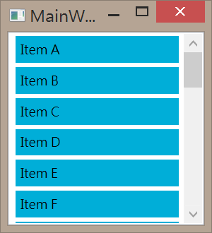
通常我們會指定 ContentAlignment 為 Stretch 讓 ListItem 的自動延展為 ListBox 的寬度,這是較美觀常見的樣式。
<!--

將 HorizontalContentAlignment 改為展開,讓項目佔滿容器寬度

-->

<ListBox ItemsSource="{Binding Items}"

         HorizontalContentAlignment="Stretch">

    <ListBox.ItemTemplate>

        <DataTemplate>

            <Grid>

                <Grid.Background>

                    <SolidColorBrush Color="#00AED8"/>

                </Grid.Background>

                <TextBlock Text="{Binding}" Padding="5"/>

            </Grid>

        </DataTemplate>

    </ListBox.ItemTemplate>

</ListBox>
ListBox 內的每個項目之所以可以一項一頁的向下排,原因在於 ListBox 的內部容器為 StackPanel,在 Windows Phone 上面則是預設為 VirtualizingStackPanel,將 StackPanel 的 Orientation 改為水平即可變成水平排列及出現水平捲軸。

<!--

ItemsPanel 預設為 StackPanel

把 StackPanrl 的 Orientation 設為水平看看效果

-->

<ListBox ItemsSource="{Binding Items}"

         VerticalContentAlignment="Stretch">

    <ListBox.ItemsPanel>

        <ItemsPanelTemplate>

            <StackPanel Orientation="Horizontal"/>

        </ItemsPanelTemplate>

    </ListBox.ItemsPanel>

    <ListBox.ItemTemplate>

        <DataTemplate>

            <Grid>

                <Grid.Background>

                    <SolidColorBrush Color="#00AED8"/>

                </Grid.Background>

                <TextBlock Text="{Binding}" Padding="5"/>

            </Grid>

        </DataTemplate>

    </ListBox.ItemTemplate>

</ListBox>
如果要在 ListBox 中放入二維排列的項目時,利用容器 WrapPanel 的特性即可達到效果,比較需要注意的是先前有提到,WrapPanel 需要指定高度或寬度,才能算出哪個子項目該換到下一行。

<!--

將 ItemsPanel 改為 WrapPanel

並且將 WrapPanel 的寬度設為父容器的寬度

讓 WrapPanel 的內容能夠在適當的寬度時換行

-->

<ListBox ItemsSource="{Binding Items}">

    <ListBox.ItemsPanel>

        <ItemsPanelTemplate>

            <WrapPanel Orientation="Horizontal"

                       Width="{Binding

                                Path=ActualWidth,

                                RelativeSource={RelativeSource

                                Mode=FindAncestor,

                                AncestorType={x:Type ScrollContentPresenter}}}"/>

        </ItemsPanelTemplate>

    </ListBox.ItemsPanel>

    <ListBox.ItemTemplate>

        <DataTemplate>

            <Grid>

                <Grid.Background>

                    <SolidColorBrush Color="#00AED8"/>

                </Grid.Background>

                <TextBlock Text="{Binding}" Padding="5"/>

            </Grid>

        </DataTemplate>

    </ListBox.ItemTemplate>

</ListBox>
以上 ListBox 的 Model 程式碼很簡單,三個都一樣如下,僅 XAML 有差異
public partial class MainWindow : Window

{

    public MainWindow()

    {

        InitializeComponent();


        items = new List<String>();

        for (int i = 0; i < 26; ++i)

        {

            items.Add(String.Format("Item {0}", "ABCDEFGHIJKLMNOPQRSTUVWXYZ"[i]));

        }


        DataContext = this;

    }


    private List<String> items;

    public List<String> Items

    {

        get

        {

            return items;

        }

    }

}
沒有留言:
張貼留言