首先來讀一下 Material Design 的 Drawer guideline:Navigation drawer
如何加入 Navigation drawer 的過程可以直接用 Android Studio 開啟包含 Drawer 與 Fragment 的專案就很清楚了,那個空專案將 Drawer 相關流程管理在一個叫 NavigationDrawerFragment 的 class 中,可以切得很乾淨,但不利於做紀錄,所以這裡用一個最單純的 Drawer Layout 檔案分佈來當範例
activity_main.xml
由單一 RelativeLayout 為 root 改為使用 v4.widget.DrawerLayout 為 root,並且包含一個放置 App 內容的 View 與一個 Drawer 內容的 View,而放 Drawer 內容的 layout 描述我們習慣用 include 的,以免 MainActivity 的 Layout 過長。
<android.support.v4.widget.DrawerLayout

 xmlns:android="http://schemas.android.com/apk/res/android"

 android:id="@+id/drawer"

 android:layout_width="match_parent"

 android:layout_height="match_parent">


 <FrameLayout

  android:id="@+id/main_layout"

  android:layout_width="match_parent"

  android:layout_height="match_parent">

 </FrameLayout>


 <include layout="@layout/layout_drawer"/>


</android.support.v4.widget.DrawerLayout>
layout_drawer.xml
當你的 Drawer 被拉出來時想長怎樣就怎麼描述這個 Layout 檔,注意新手常卡關的白痴錯誤,是 android:layout_gravity="start" 不是 android:gravity="start",如果希望 Drawer 由右側拉進可以將值改為 end
<?xml version="1.0" encoding="utf-8"?>

<LinearLayout

 xmlns:android="http://schemas.android.com/apk/res/android"

 android:id="@+id/navigation_drawer"

 android:orientation="vertical"

 android:layout_width="@dimen/drawer_width"

 android:layout_height="match_parent"

 android:background="@android:color/darker_gray"

 android:layout_gravity="left">

 <!-- dimen/drawer_width = 320dp -->

 <!-- 這裡擺上你希望出現在 Drawer 內的元件 -->

</LinearLayout>
MainActivity.java
新增 ActionBarDrawerToggle 管理 Drawer 開合等相關事件,與在 onPostCreate、onConfigurationChanged 事件中更新狀態
import android.content.res.Configuration;

import android.support.v4.widget.DrawerLayout;

// v4 的 ActionBarDrawerToggle 已 Deprecated

// 需使用 v7 的才可以整合 Toolbar 完成接下來的調整

import android.support.v7.app.ActionBarDrawerToggle;

import android.support.v7.app.AppCompatActivity;

import android.os.Bundle;


public class MainActivity extends AppCompatActivity {


 private ActionBarDrawerToggle drawerToggle;

 private DrawerLayout drawerLayout;


 @Override

 protected void onCreate(Bundle savedInstanceState) {

  super.onCreate(savedInstanceState);

  setContentView(R.layout.activity_main);

  initDrawer();

 }


 @Override

 protected void onPostCreate(Bundle savedInstanceState) {

  super.onPostCreate(savedInstanceState);

  drawerToggle.syncState();

 }


 @Override

 public void onConfigurationChanged(Configuration newConfig) {

  super.onConfigurationChanged(newConfig);

  drawerToggle.onConfigurationChanged(newConfig);

 }


 protected void initDrawer() {

  drawerLayout = (DrawerLayout) findViewById(R.id.drawer);

  drawerToggle = new ActionBarDrawerToggle(this,

    drawerLayout,

    R.string.navigation_drawer_open,

    R.string.navigation_drawer_close);

  drawerLayout.setDrawerListener(drawerToggle);

  drawerToggle.syncState();

 }

}
加上適當的顏色後,以上的程式碼執行結果可以得到一個單純的 navigation Drawer 如下

接下來要開始加入 Material Design 的相關參數
style.xml
首先在 style.xml 中將 parent 改為 NoActionBar 或是將 windowsActionBar 設為 false 的方式去除 ActionBar,接著加入以下 Level 21 或 19 才支援的項目,這個專案的 minSdkVersion 是 14 理論上我應該使用 values-v21 這種方式來撰寫,但這裡我使用 tools:targetApi 來避免編譯錯誤的方式將所有 style 項目都寫在同一個 xml 檔案中。
<resources

 xmlns:android="http://schemas.android.com/apk/res/android"

 xmlns:tools="http://schemas.android.com/tools">


 <!-- 將 Parent 由 DarkActionBar 換成 NoActionBar -->

 <style name="AppTheme" parent="Theme.AppCompat.NoActionBar">

  <!-- Action Bar 會吃這個顏色 -->

  <item name="android:colorPrimary" tools:targetApi="21">@color/primary</item>

  <!-- status bar 會吃這個顏色 -->

  <item name="android:colorPrimaryDark" tools:targetApi="21">@color/primary_dark</item>

  <!-- Toolbar title 會吃這個顏色 -->

  <item name="android:textColorPrimary" tools:targetApi="21">@color/text_primary</item>

  <!-- Toolbar title Home button 會吃這個顏色 -->

  <item name="android:textColorSecondary">@color/text_secondary</item>

  <!-- 特定 UI 元件,例如 checkbox 會吃這個顏色 -->

  <item name="android:colorAccent" tools:targetApi="21">@color/color_accent</item>

  <!-- 設定畫面的背景色 -->

  <item name="android:windowBackground">@android:color/white</item>

  <!-- 在 KitKat 以上支援將 status bar 設為半透明 -->

  <item name="android:windowTranslucentStatus" tools:targetApi="19">true</item>


  <!-- 如果基於設計等原因無法使用 NoActionBar 系列的 Base Theme 可以加入這兩行移除 ActionBar -->

  <!--<item name="windowActionBar">false</item>-->

  <!--<item name="windowNoTitle">true</item>-->

 </style>


</resources>
在上面的 style.xml 中可以看到一些註解,其中 windowTranslucentStatus 這個項目比較特殊,這個項目是在 Level 19 就支援了,但在 Level 19、20 的表現效果與 Level 21 以上是不同的,在 Level 21 時 status bar 會畫上 colorPrimaryDark 這個顏色加上 20% 的半透明效果,但在 19、20 的環境會畫上黑色到透明的漸層,無法指定顏色。其他 Level 21 新增的項目各會被用在哪裡,可以參考這張官方的圖片。
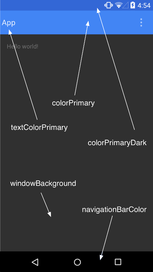
比較需要注意的是圖片中說明 ActionBar 會使用 colorPrimary 這點沒錯,但我實際測試這個值對於 Toolbar 並不起作用,所以需要在 Toolbar 的 Layout 中自行撰寫背景色。
activity_main.xml
在 MainActivity 的 Layout 中所做的修改還算單純,我們只需要在放置 fragment 的 Layout 中加入一個 v7.widget.Toolbar,這裡一樣使用 include 的方式避免檔案過長不好閱讀。
<android.support.v4.widget.DrawerLayout

 xmlns:android="http://schemas.android.com/apk/res/android"

 android:id="@+id/drawer"

 android:layout_width="match_parent"

 android:layout_height="match_parent"

 android:fitsSystemWindows="true">


 <FrameLayout

  android:id="@+id/main_layout"

  android:orientation="vertical"

  android:layout_width="match_parent"

  android:layout_height="match_parent">


  <include layout="@layout/layout_toolbar"/>


 </FrameLayout>


 <include layout="@layout/layout_drawer"/>


</android.support.v4.widget.DrawerLayout>
layout_toolbar.xml
上面說過了 Toolbar 並不會像 ActionBar 一樣自動拿 android:colorPrimary 顏色來當作底色,所以需要自行指定,其他文字和漢堡 (Home) 的顏色就不需再另外指定了。
<?xml version="1.0" encoding="utf-8"?>

<android.support.v7.widget.Toolbar

 xmlns:android="http://schemas.android.com/apk/res/android"

 android:id="@+id/toolbar"

 android:layout_height="wrap_content"

 android:layout_width="match_parent"

 android:background="@color/primary"

 android:elevation="2dp">

 <!-- 需自行指定 background 額外再加上 2dp 的高度製造陰影 -->

</android.support.v7.widget.Toolbar>
layout_drawer.xml
Drawer Layout 的部份也沒什麼特別的修改,唯一需要注意的是我們指定了 android:fitsSystemWindows 為 true,這是因為我們將 status bar 透過 android:windowTranslucentStatus 設為半透明後,視窗的邊界會延伸到螢幕的最頂端,而非以往的 status bar 底部,會導致 Toolbar 與 status bar 重疊的狀況,有兩種方法可以解,一種是為 Toolbar 設 padding 值,另一種是指定這個屬性值讓 windowTranslucentStatus 的行為改變,上面的 activity_main.xml 也是因此目的而加上這個值。
<?xml version="1.0" encoding="utf-8"?>

<LinearLayout

 xmlns:android="http://schemas.android.com/apk/res/android"

 android:id="@+id/navigation_drawer"

 android:orientation="vertical"

 android:layout_width="@dimen/drawer_width"

 android:layout_height="match_parent"

 android:layout_gravity="start"

 android:fitsSystemWindows="true">

</LinearLayout>
沒有指定 android:fitsSystemWindows="true" 看起來會是下圖這種奇怪的狀態。但是如果在 Level 19 的環境上沒有特別想要讓 status bar 變成漸層透明的,可以把 windowTranslucentStatus 為 true 的這個項目移除,並且把 colorPrimaryDark 改為 ARGB 的格式,可以在 Level 21 的環境上產生和最底下的動圖一樣的正確效果,因為讓 Drawer Layout 出現在 status bar 底下主要是 fitsSystemWindow 設定後填滿螢幕的效果。

在 Activity 中唯一的變化只有初始化 Toolbar 的過程,並指定為 drawerToggle 的參數之一
protected void initDrawer() {

 Toolbar toolbar = (Toolbar) findViewById(R.id.toolbar);

 setSupportActionBar(toolbar);

 toolbar.setTitle(R.string.app_name);

 drawerLayout = (DrawerLayout) findViewById(R.id.drawer);

 drawerToggle = new ActionBarDrawerToggle(this,

   drawerLayout,

   toolbar,

   R.string.navigation_drawer_open,

   R.string.navigation_drawer_close) {

 };

 drawerLayout.setDrawerListener(drawerToggle);

 drawerToggle.syncState();

}
經過這個步驟後,就可套用 Toolbar 取代 ActionBar 並將 Drawer 修改為符合 Material Design guideline 的樣式如下圖

改用 Toolbar 後乍看之下會覺得 colorPrimary 沒有必要,但這個值非常建議不要省略,在往後很多 Material Design 的相關元件都會用到,除了這個原因之外,在 Recent Apps 列表中也會拿這個值來顯示縮圖,在上面的動畫應該可以發現。最後,我想整理一下兩個會互相衝突的屬性之間搭配下的結果,因為這裡我花了一些時間嚐試效果。
這種配置可以讓 Android 4.4 status bar 顯示半透明漸層,並可讓 Android 5.0 以上 status bar 畫出 20% 透明的 #666666
// style.xml 中

<item name="android:colorPrimaryDark" tools:targetApi="21">#666666</item>

<item name="android:windowTranslucentStatus" tools:targetApi="19">true</item>


// activity_main.xml 中

android:fitsSystemWindows="true"
這個配置在 Android 4.4 顯示傳統的不透明深色 status bar,但可讓 Android 5.0 以上顯示 #CCFF0000 這種 20% 半透明紅色
// style.xml 中

<item name="android:colorPrimaryDark" tools:targetApi="21">#CCFF0000</item>

<item name="android:windowTranslucentStatus" tools:targetApi="19">false</item>


// activity_main.xml 中

android:fitsSystemWindows="true"
這種配置在 Android 5.0 可以自行在 status bar 上色 #CCFF0000 但無法讓 Drawer 疊在 status bar 底下
// style.xml 中

<item name="android:colorPrimaryDark" tools:targetApi="21">#CCFF0000</item>

<item name="android:windowTranslucentStatus" tools:targetApi="19">false</item>


// activity_main.xml 中

android:fitsSystemWindows="false"
也可以在 Activity 中 call 這個 Method 對 status bar 著色
@TargetApi(Build.VERSION_CODES.LOLLIPOP)

private void drawColorToStatusBar() {

 Window window = getWindow();

 window.addFlags(WindowManager.LayoutParams.FLAG_DRAWS_SYSTEM_BAR_BACKGROUNDS);

 window.setStatusBarColor(getColor(R.color.primary_dark));

}
請問如用navigation view 可以套用os 4.4.2以下嗎?
回覆刪除